When visuals and
words work
together with
purpose, it’s a
match made in
heaven.
They stand out,
speak to the
people who matter
the most and
stop the scroll.
That’s when instincts, tactics, storytelling and aesthetics align to shape content that feels memorable, meaningful and distinctive.
Campaign Concepts is a curated collection of fictional brands I’ve ideated and developed to showcase how my work shows up socially, culturally and creatively.
Each concept is rooted in strategy, shaped by storytelling and brought to life through expressive copy, creative direction and cross‑channel thinking.
Where strategy meets scroll‑stopping storytelling. Where concepts become campaigns.
Looking for a
creative partner in
YOUR corner?

All imagery and brand references featured are sourced from platforms such as Pinterest and used solely for exploration and creative direction.
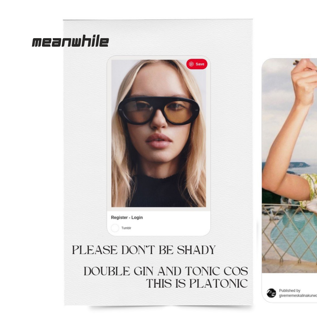
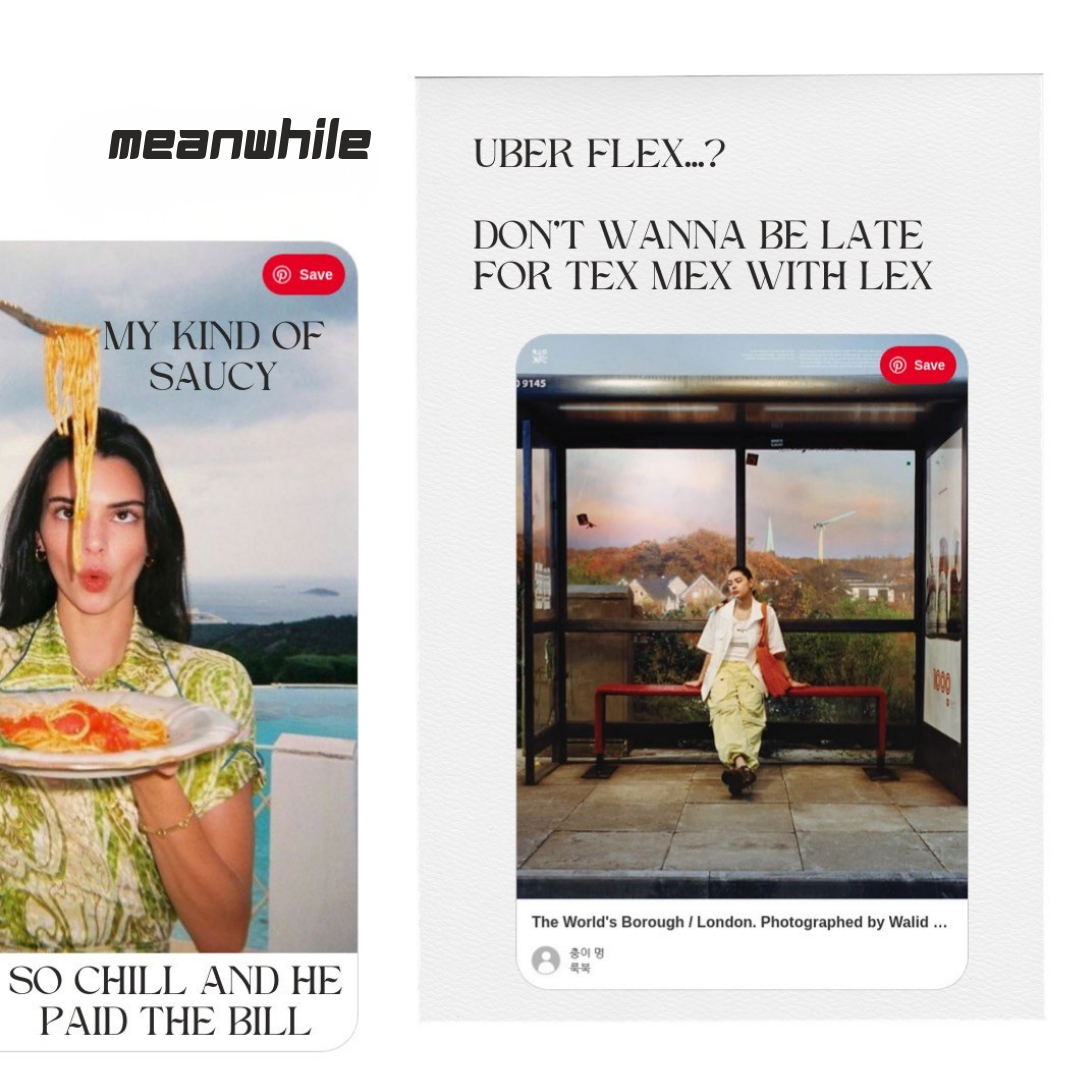
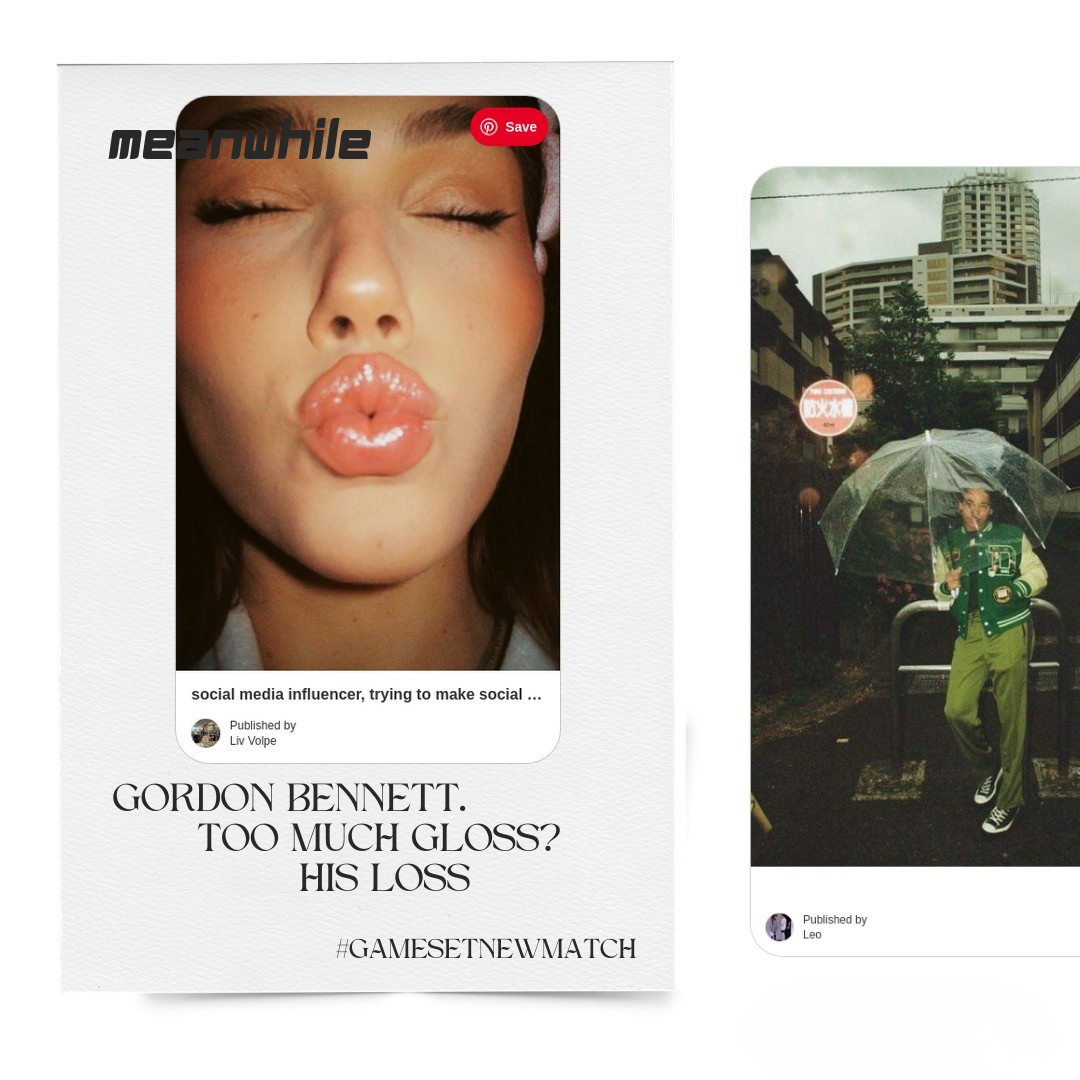
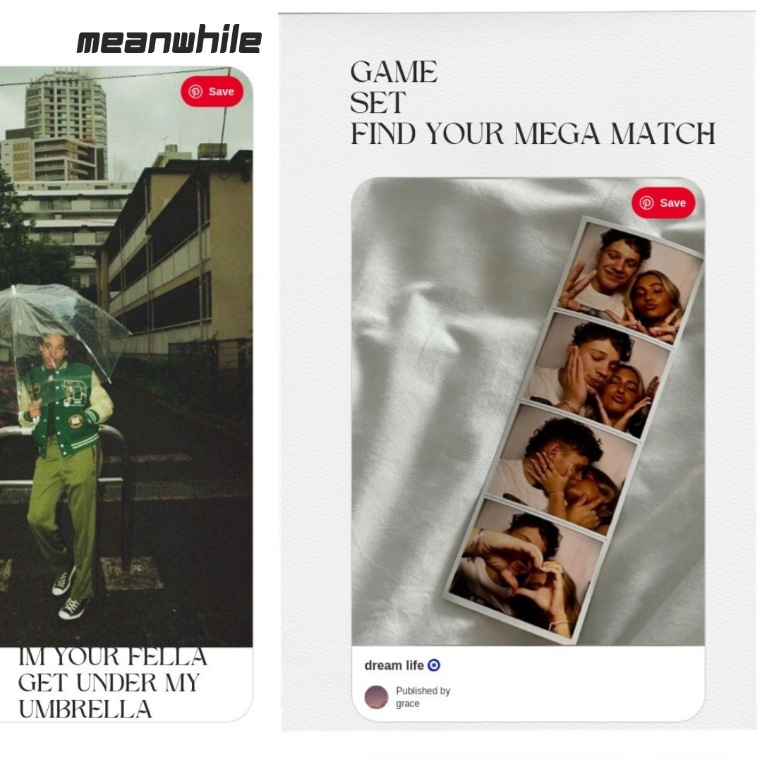
Meanwhile
is a fictional dating app designed to reframe modern romance with more humanity.
WHY Meanwhile
exists
is a fictional dating app designed to reframe modern romance with more humanity - and a lot less pressure. It is ideated, conceptualised and developed to cut through swiping fatigue with warmth, wit and a grounded sense of realism - the antidote to the high‑stakes, high‑expectation culture of modern dating.
It reframes dating as a collection of small, everyday moments rather than performance or perfection. The work explores how a dating brand can show up socially and culturally using language that feels playful, human and intentionally light‑hearted.
HOW Meanwhile
shows up
Meanwhile’s meaning is intentionally light‑hearted - rooted in optimism, grounded in reality and designed to feel like a breath of fresh air in a tired category.
Every line is crafted to feel instantly “Meanwhile”: warm, witty, self‑aware and built for social behaviour. It’s dating without the dramatics - scroll‑stopping copy, soft visuals and a voice that nudges people to lean in rather than revert to not bothering at all.
WHAT I explored
I shaped a tone that reframes dating as everyday storytelling rather than performance - pairing playful, copy‑led lines with editorial‑style visuals.
The concept leans into shared situations, mutual connections and the familiar “almost moments” that make modern romance feel more human.
Alongside the language, I developed campaign mock‑ups to show how Meanwhile could live socially, culturally and creatively across channels.
WHAT this says
about me
Meanwhile shows how I shape brands that feel human - where strategy, storytelling and creative direction work together to shift a category conversation.
It reflects how I bring clarity, character and cultural awareness into every project, creating concepts that feel intentional, expressive and emotionally intelligent.
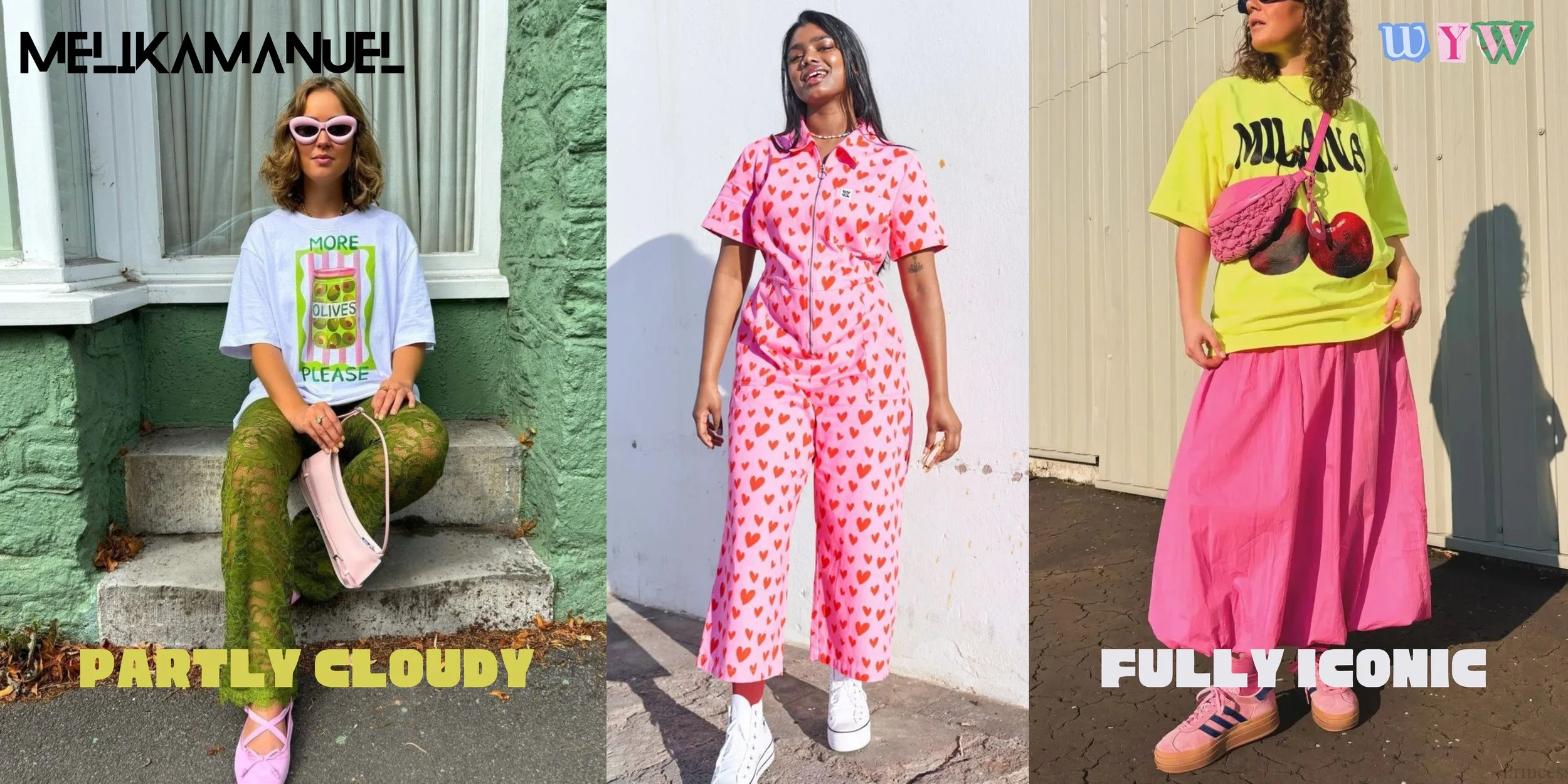
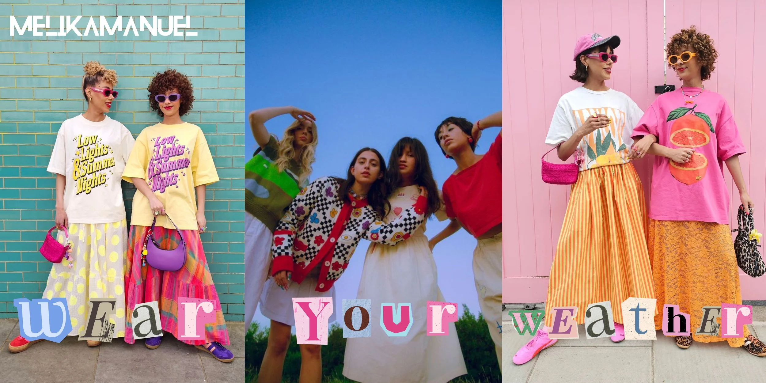
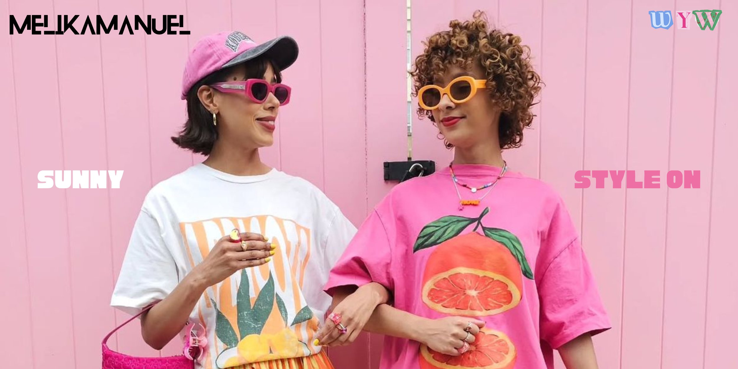
Meet Melika
Manuel
a fictional, female‑founded womenswear brand celebrating expressive design, ethical production and the joy of showing up as your fullest self.
WHY Melika Manual
exists
Melika Manuel exists to bring colour, character and confidence back into everyday wardrobes - without compromising on values or individuality.
Its mission is simple: to create expressive, ethically made pieces that empower people to dress with joy, intention and a sense of self.
Its vision is a world where fashion feels good - emotionally, culturally and ethically - championing creativity without the cost to people or the planet.
It’s fashion with a conscience, designed for people who want to feel great in what they wear and where it comes from.
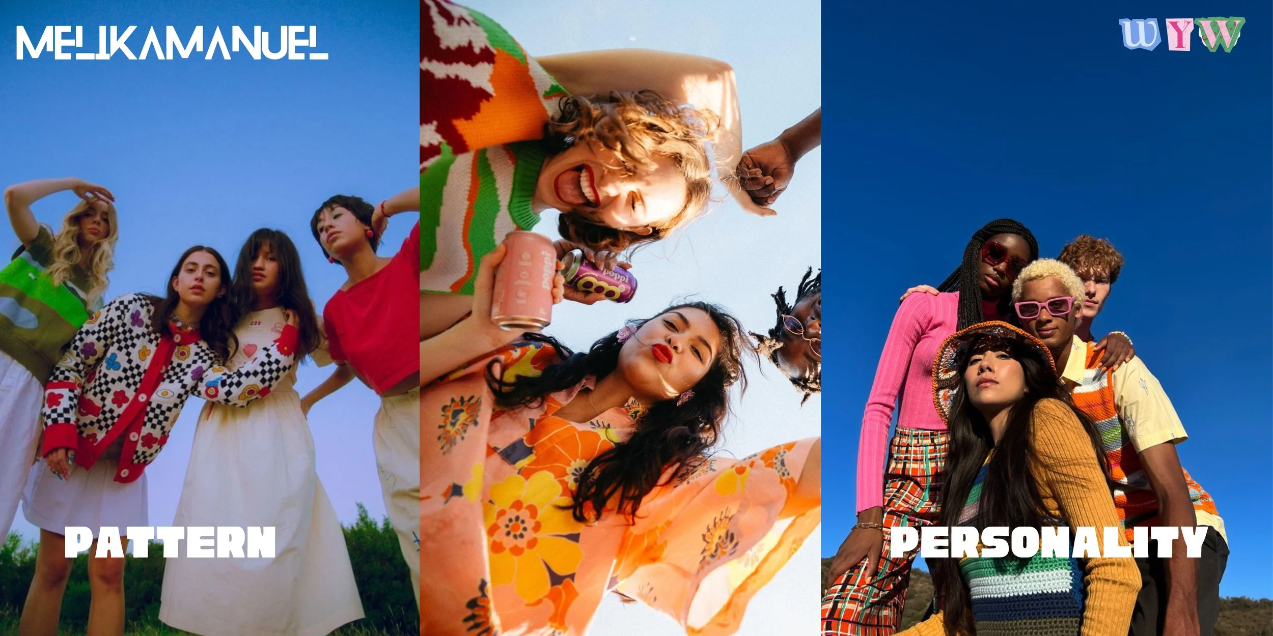
HOW Melika Manuel
Shows up
Melika Manuel’s world is vibrant, character‑filled and rooted in self‑expression. The creative direction is crafted to feel instantly “Melika”: bold, joyful, ethical and unapologetically vibrant.
The tone is warm and human - celebrating personality, pattern and the power of dressing in a way that feels like you. It’s fashion that sparks conversation, builds community and brings aura into the everyday, whatever the weather.
WHAT I explored
I explored how an ethical womenswear brand can show up socially and culturally with personality at its core - pairing playful language with bold, editorial‑style visuals.
The concept leans into pattern, colour and mood as storytelling tools, imagining how Melika Manuel could communicate across social, campaign and community‑led moments.
Alongside the voice and messaging, I developed campaign mock‑ups to show how the brand could live across channels with consistency and character.
WHAT this says
about me
Melika Manuel reflects my ability to think conceptually and shape brands that feel expressive and emotionally intelligent - where strategy, storytelling and creative direction work together to build something memorable and culturally tuned.
It shows the clarity, character and creative vibe I bring into every project, crafting concepts that feel intentional, joyful and rooted in a point of view.
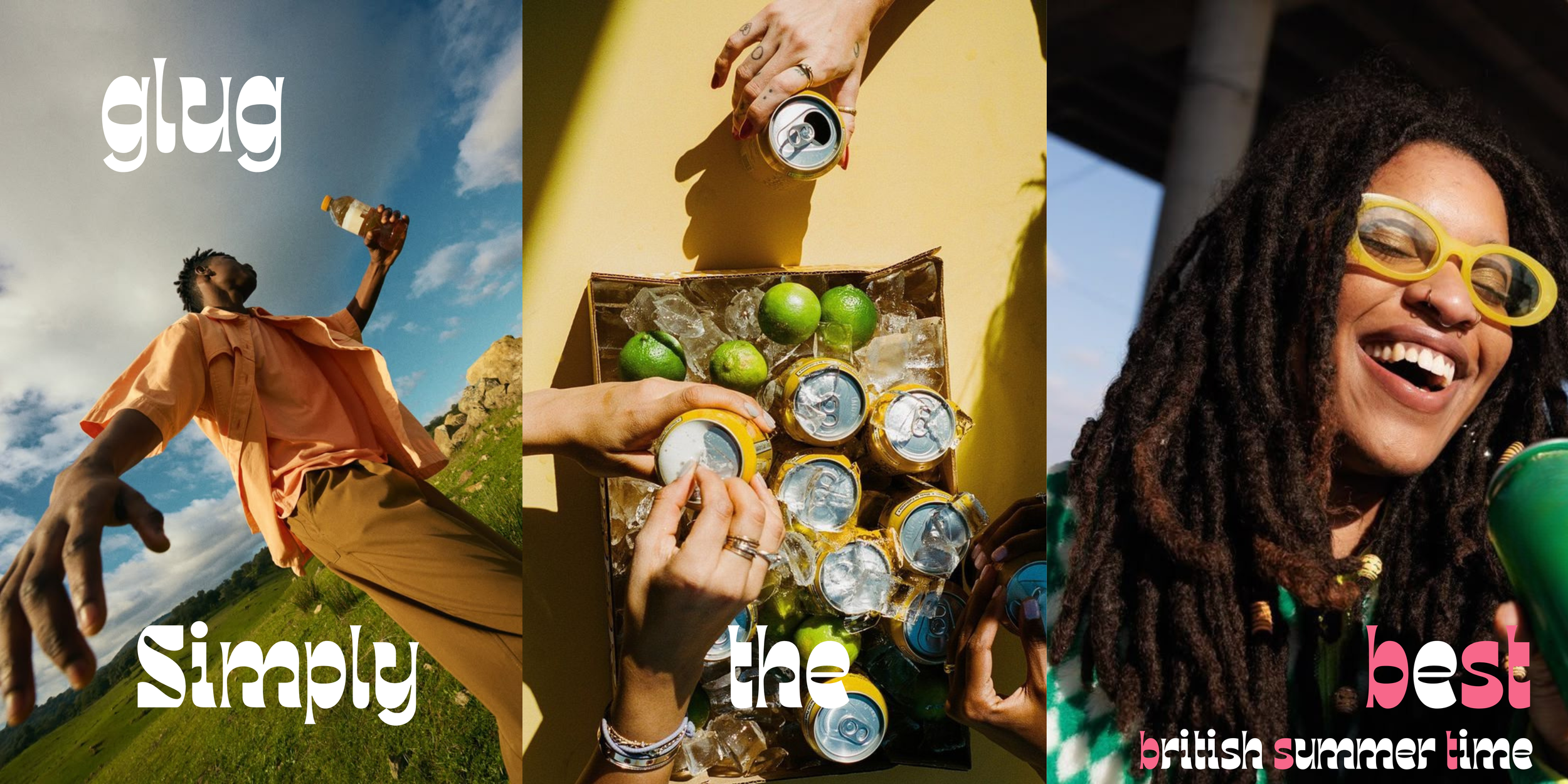
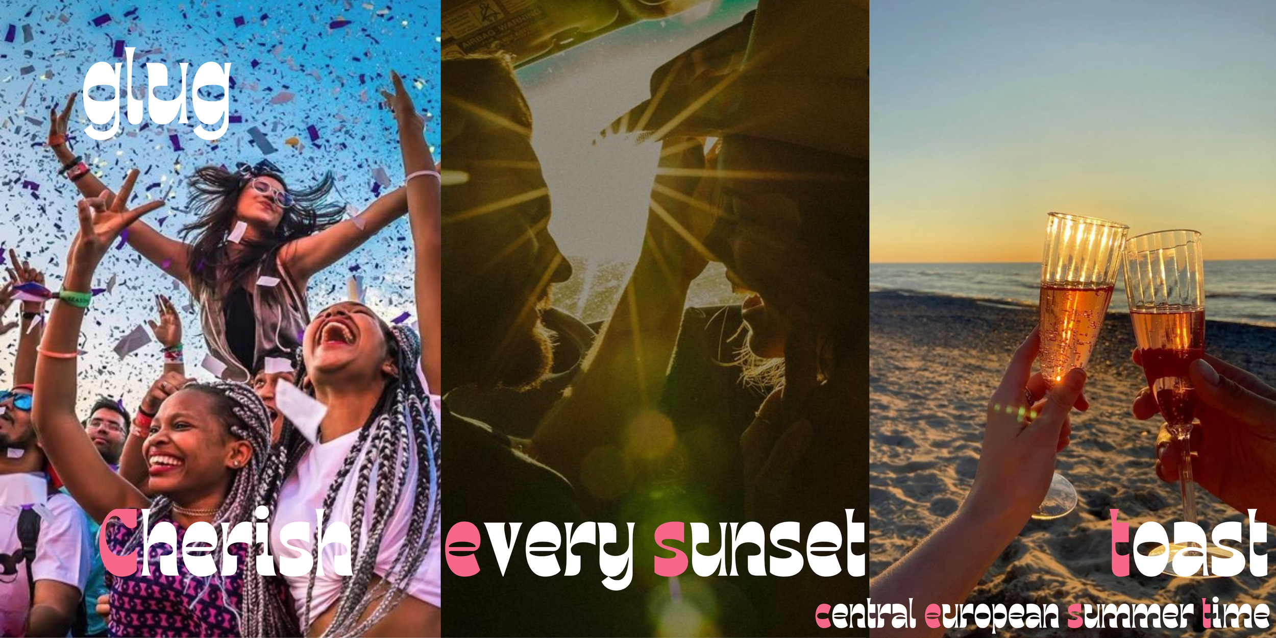
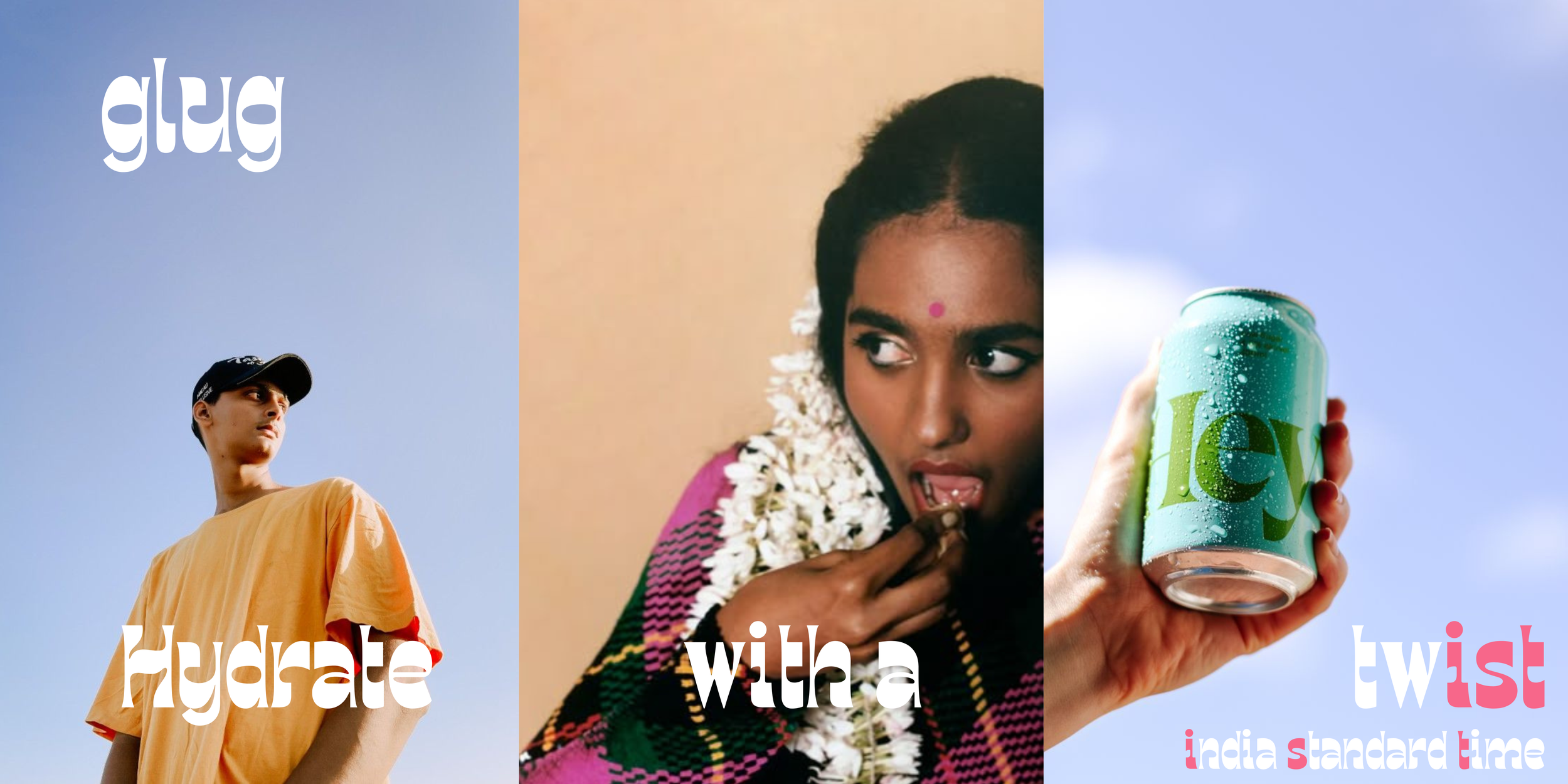
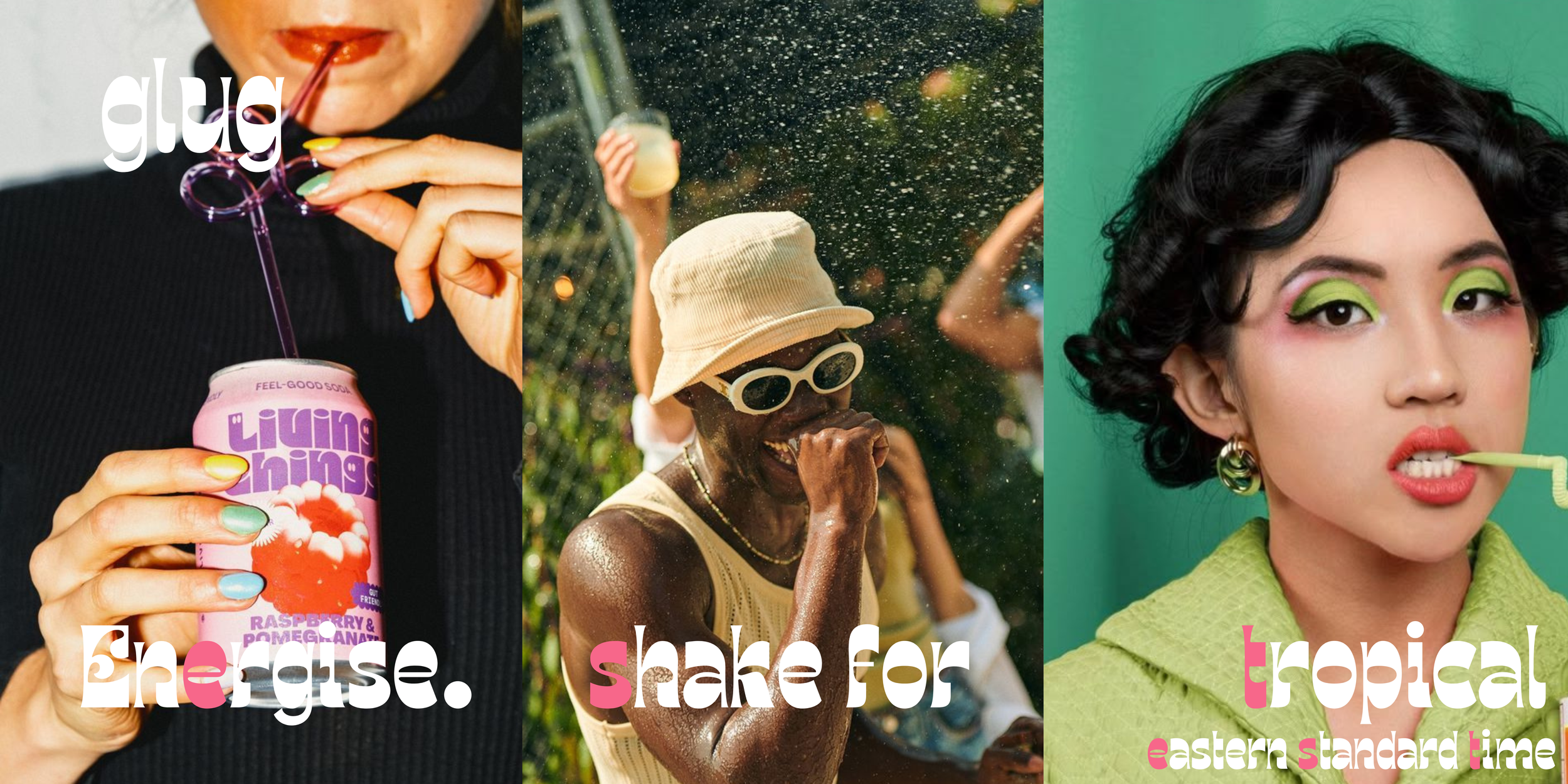
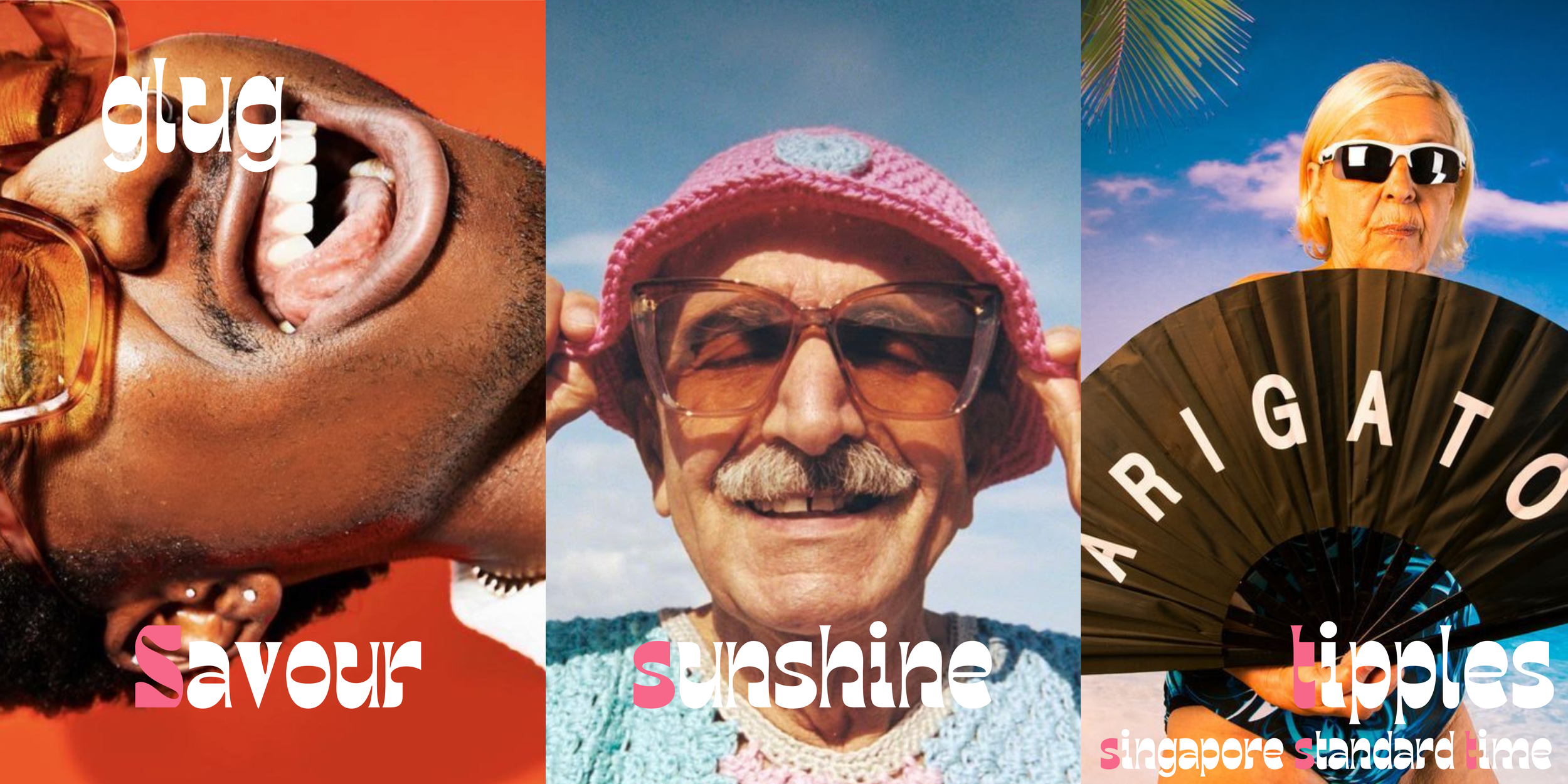
Glug
the can to grab on the go, is a fictional drinks brand brought to life through strategy, storytelling and creative direction.
WHY Glug exists
Glug is my way of exploring how an FMCG drinks brand can show up with personality and a pop of cultural energy. It’s built to demonstrate how a brand can feel alive in seasonal moments, Social behaviour and expressive storytelling - the kind of world where copy, culture and creativity work together with intention.
WHAT I explored
After shaping the brand and marketing strategy, I mapped out how Glug could flex across socials, web, shop windows and Out‑of‑Home as part of a brand awareness push. The idea centred around pairing energetic statements with playful time‑zone wordplay - a messaging device that can stretch across formats, markets and moments.
To support the narrative, I developed mood boards and mock‑ups to guide designers and photographers, giving a clear starting point for how Glug should show up visually both IRL and on screen.
HOW Glug shows up
For Glug’s Spring/Summer campaign, I shaped culture‑led moments into scroll‑stopping copy and creative. Every line is designed to feel unmistakably “Glug”: vibrant, playful, adaptable and ready for UGC engagement. The campaign is built to move - across channels, across seasons and across audiences.
WHAT it says about me
Glug reflects how I think: strategically, artistically and boldly. It shows how I bring together tone of voice, storytelling, touch points and creative direction to build campaigns that feel alive - the kind that spark conversation, drive engagement and shape how a brand shows up.
I bring clarity, energy and character into every project so the work is felt, seen, understood and remembered for the right reasons.
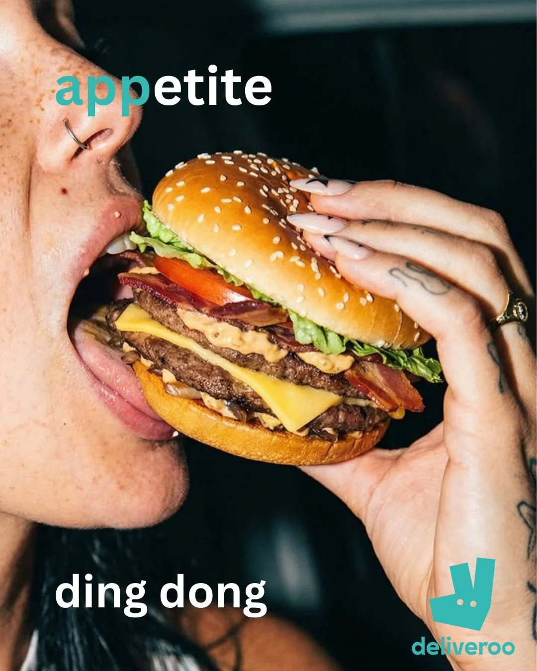
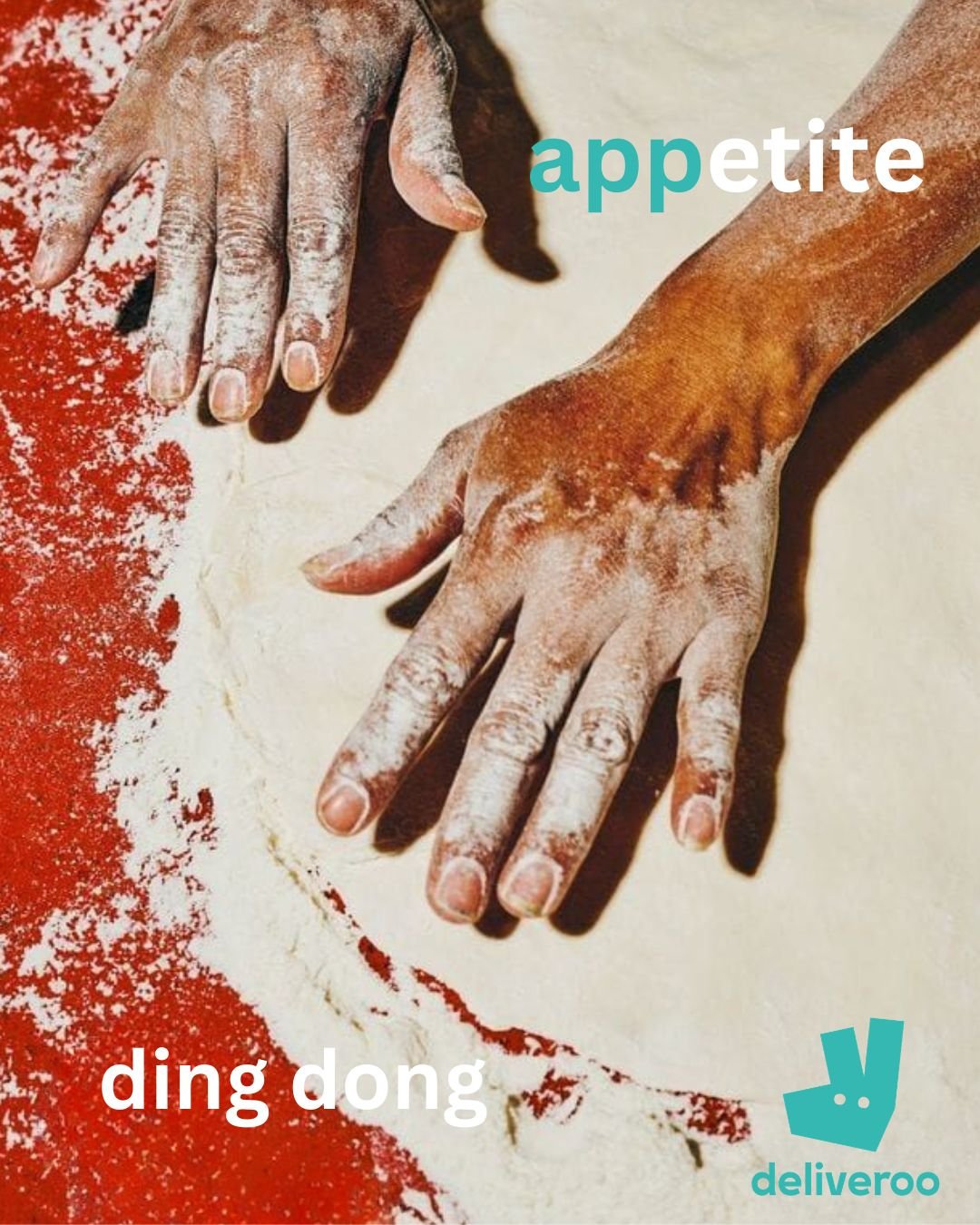
ADVERT ASSORTMENTS
features a curated selection of household brands used solely to showcase campaign ideation, creative direction and whipped words.
All imagery featured is sourced from platforms such as Pinterest and used solely for exploration and portfolio purposes.
WHY this series
exists
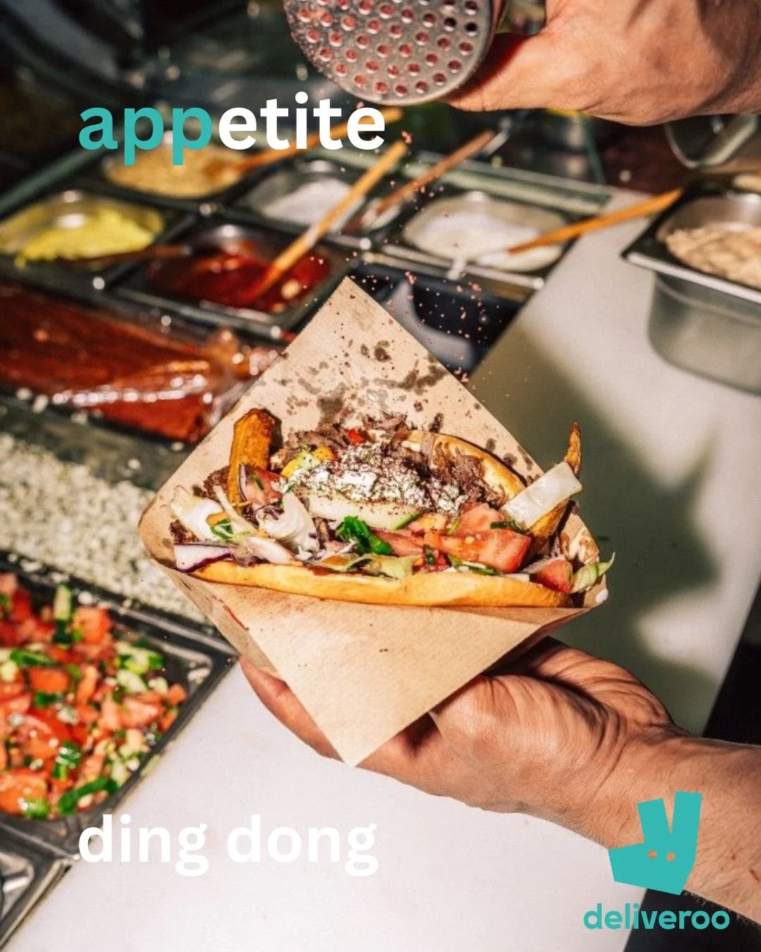
This series exists to explore how appetite, behaviour and simplicity can work together to drive conversion on a platform built for convenience. It’s designed to show how Deliveroo can appear in the exact moments people are most likely to order - tired evenings, hungover mornings, mid‑week slumps and the universal “I can’t be bothered to cook” feeling.
The work distils Deliveroo’s world into three high‑impact ads: appetite‑driven visuals, clean copy and a single call‑to‑action that nudges people from scrolling to visiting to the app and ordering.
It demonstrates how I think about behavioural insight, conversion‑focused copy and multi‑channel creative direction within a real brand ecosystem.
WHAT I explored
I explored how Deliveroo can speak directly to real‑world behaviour - the slump, the craving, the “I’m not cooking tonight” moment. The concept pairs appetite‑led photography with simple, sharp copy to tap into the emotional triggers that make convenience irresistible.
I shaped a creative system that flexes across social, web and OOH: bold food close‑ups, hands‑on moments, texture, movement and a single, conversion‑ready CTA. The exploration shows how Deliveroo’s brand world can stretch across channels while staying instantly recognisable and behaviour‑driven.
HOW this series
shows up
This series shows up with appetite, simplicity and personality. Each advert feels instantly Deliveroo: bold food photography, scroll‑stopping colour and copy that’s warm, playful and rooted in human behaviour.
The tone leans into the brand’s signature energy while the creative system keeps everything clean, flexible and conversion‑focused. It’s built to work hard across formats: social tiles, story placements, web banners and OOH.
Every line nudges the viewer from thinking about food to ordering food. It meets people exactly where they are - on the sofa, in the slump, or in the “ding dong” moment before breakfast, lunch or dinner is at the door.
WHAT this says
about me
This series shows how I turn a simple human truth into a multi‑channel creative idea that feels brand‑true, behaviour‑led and conversion‑ready.
It reflects how I blend strategy, storytelling and creative direction to build work that’s intentional, distinctive and culturally tuned.
It demonstrates my ability to think in systems rather than single assets, shape copy that’s clear, confident and appetite‑driven, build creative that works across formats and audiences, and anchor ideas in real‑world behaviour rather than aesthetics.
Post. Pitch. Prosper.

blends both Beckhams - the nostalgic charm of Bend It Like Beckham and the polished world of Victoria Beckham Beauty - into a playful, culturally aware concept that nods back to 2002 while still feeling fresh today.
It taps into the idea that perfecting play on the pitch and perfecting your base share the same foundations: quality, control and precision.
This campaign concept explores how a beauty brand can show up with personality, confidence and a subtle wink to VB’s iconic style, pairing elevated natural beauty with a moment of cultural fun.
It shows how I think about cultural cues and creative simplicity to shape ideas that feel intentional, expressive and instantly memorable - turning every application into a skin‑winning league moment.

A playful, concept
exploring how an
everyday, ethical
ethical product
can show with
authority in
an amenity market.
WHY this exists
This series exists to explore how a sustainability‑driven household brand can communicate with tongue‑in‑cheek humour while staying true to its mission. It shows how a values‑led product can stand out in a crowded category by leaning into personality and purpose rather than safe, expected messaging.
WHAT I explored
I explored how a domestic brand can use playful language and pattern‑driven visuals to give a mundane product personality.
The work leans into the brand’s signature humour, experimenting with colour, repetition and typography to create a visual rhythm that feels unmistakably “WGAC” while staying flexible across social, web and packaging‑adjacent placements.
The exploration focuses on keeping sustainability messaging light, human and culturally tuned - never preachy, always personable.
HOW it shows up
This series shows up with charm, colour and a confident wink. Each asset pairs bold, patterned packaging with crisp, minimal copy to create a contrast that feels modern, memorable and unmistakably WGAC.
The tone is cheeky but grounded - celebrating the everyday and elevating one of life’s most mundane products with personality.
It’s built for scroll‑stopping simplicity: bright palettes, clean layouts and lines that land quickly across social, web and OOH.
WHAT this says about
me
It demonstrates how I deliver copy and creative direction that feel distinctive, meaningful and memorable - an instinct for what resonates, always rooted in brand objectives and audience understanding.
It reflects how I bring clarity, character and creative intuition into every project, shaping ideas that feel culturally aware, purpose‑driven and unmistakably human.
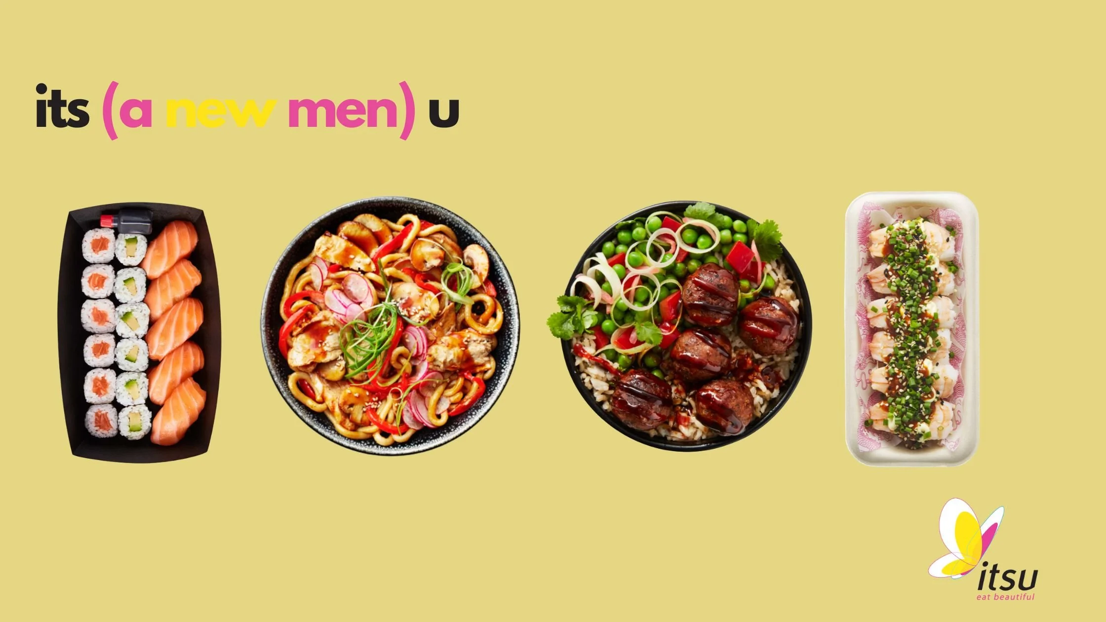
When you’re
rushing between
meetings, errands,
and just life
in general - you
want food that’s
healthy, filling and
makes you feel
good.
This Itsu OOH
concept taps into
exactly that.
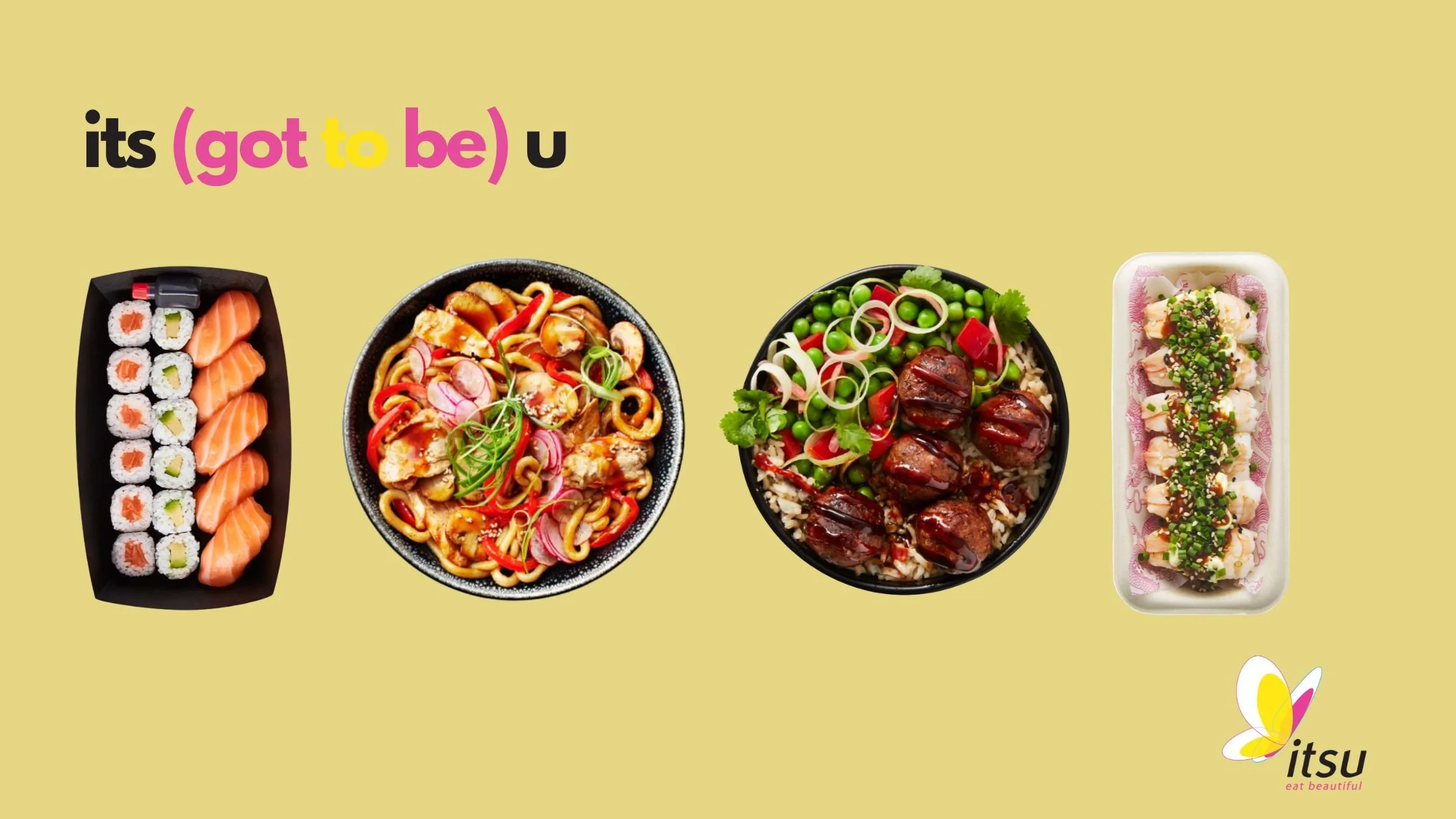
I explored how a simple shift in language can spotlight what’s new and why it should be your next to-go using clever wordsmithing and
simple, memorable messaging.
This concept shows how I bring clarity, simplicity and personality together - creating copy that feels as fresh as the food it’s inviting you to choose, and direction that helps a brand show up with confidence. It reflects how I think about behaviour‑led cues, creative clarity and brand‑first storytelling to build ideas that land quickly and linger.