Whether you’re a founder, a business owner, an independent creative turning a hobby or side‑hustle into something more satisfying, or an agency hiring manager - you’re reading this for a reason.
You are ready to say goodbye to second‑guessing.
Whatever your budget, stage of business or point in the recruitment process,
I guide you to show up with confidence, clarity and consistency.
I’m about P2P
(people to
people).
Together, we turn your ideas and intentions into thoughtful direction that delivers. Research and data set the course and inform decision‑making, ideally grounded in insight rather than guesswork. And if there’s no data yet, that’s fine - we all start somewhere.
Strategy Studio features the conceptual, fictional brands I’ve ideated and created. I shaped the brand narrative and full‑funnel strategy backed by the principles of B2C, DTC and retail marketing, with content‑led thinking, strategy at the core and a dollop of creative direction.
The work demonstrates how I think from both a marketing and creative point of view, shaping brands with clarity, creativity and commercial awareness.
If you’re curious
about what this
could look
like for your brand
or next project,
let’s talk.
All imagery featured is sourced from platforms such as Pinterest and used solely for exploration and creative direction.

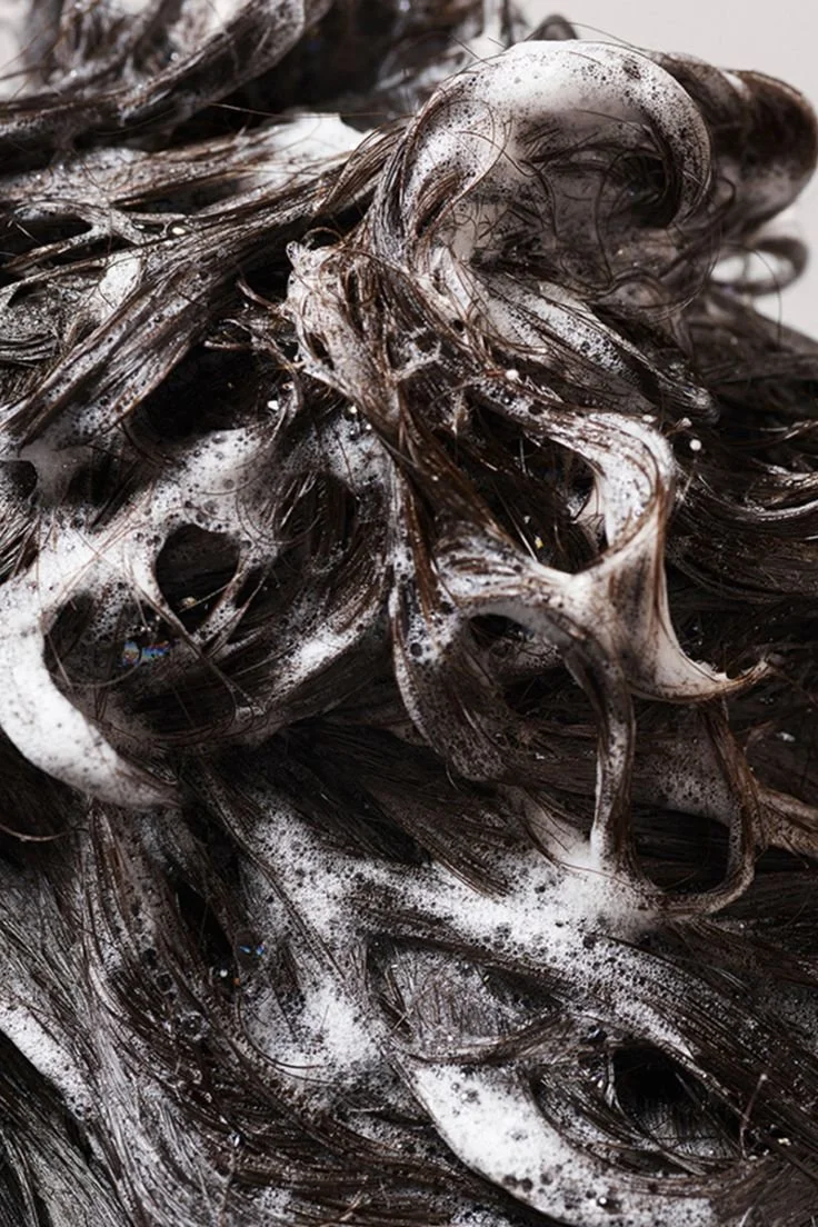
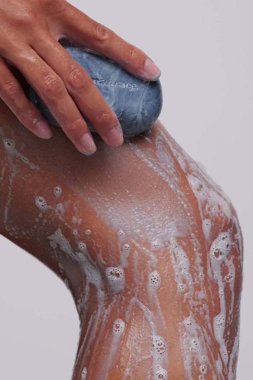
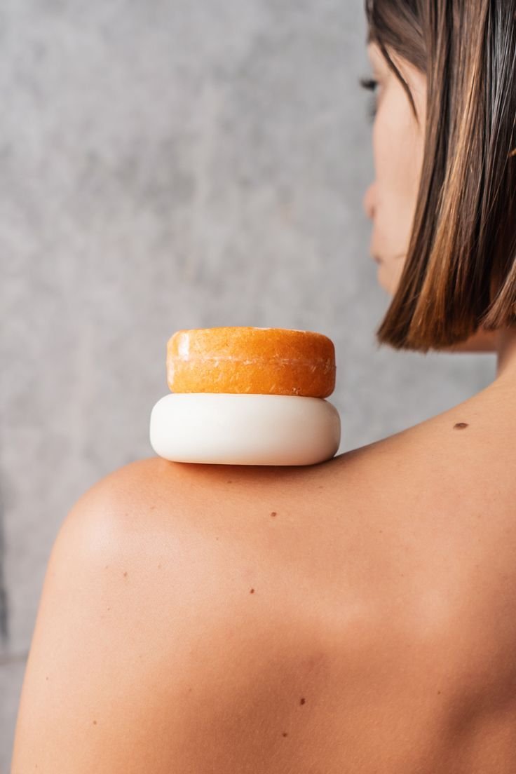
Promising beauty
partnerships
Sudsy’s mission
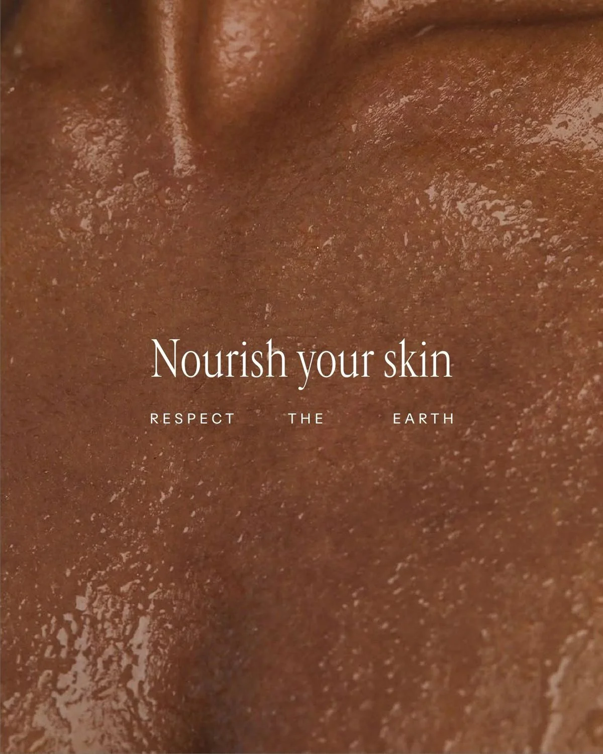
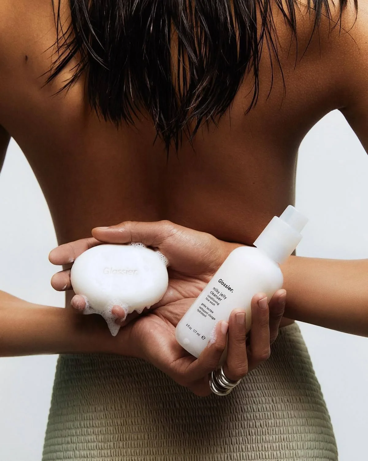
Sudsy’s mission to redefine everyday care through sustainable beauty - creating waterless, plant‑based hand, hair and body bars that deliver luxury without waste. We’re here to make low‑impact living feel effortless, elevated and sensorial, offering products that nourish people and protect the planet in equal measure.
Sudsy’s vision
Sudsy’s vision is to become a leading brand and voice in eco‑conscious innovation - a beauty brand that inspires a shift towards cleaner routines, circular systems and conscious consumption.
We aim to shape a future where premium beauty is defined not just by how it feels, but by the positive impact it leaves behind.
Creative direction
channel panel

WHY Sudsy exists
Sudsy exists to explore how a sustainable beauty brand could be ideated, developed and brought to market in the real world. It began as a conceptual partnership with Aesop - a way to imagine how a premium “underdog” brand could sit under the umbrella of an established luxury name while still holding its own identity.
Sudsy shows how a brand can champion eco‑conscious beauty without losing the sophistication, ritual and sensory pleasure people expect from premium self‑care. It’s a concept built to demonstrate how sustainability, storytelling and product desirability can coexist in one clean, modern brand world.
WHAT I explored
With Sudsy, I explored what it would take to bring a sustainable beauty brand to market - from strategic foundations to creative execution.
I developed the brand messaging, shaped the creative direction and built a tone of voice that feels elevated, ingredient‑led and quietly confident.
I mapped out audience segments, the sustainability‑driven value proposition and the partnership strategy that would allow Sudsy to grow through co‑branded products, discovery sets and retail experiences.
Sudsy became a way to demonstrate how I think about brand architecture, how I build a product story around consumer psychology, and how I translate sustainability into something modern, marketable and commercially viable.
HOW Sudsy shows
up
Sudsy shows up as a brand that blends luxury with responsibility. It lives through waterless, plant‑based formulations, compostable packaging and a visual identity that feels clean, youthful and Aesop‑adjacent without imitation. It shows up through educational touchpoints - sustainability inserts, ingredient‑led storytelling and discovery kits designed to convert curious customers into loyal ones.
Across social, Sudsy shows up through aesthetic‑driven content, ingredient spotlights and community‑led conversations around low‑waste beauty. In retail, it shows up through trial experiences, pop‑ups and co‑branded activations designed to measure real‑world engagement. Every touchpoint is built to feel premium, purposeful and planet‑aligned.
WHAT this says about
me
Sudsy reflects my ability to build a brand that balances creativity with commercial strategy. It shows that I can ideate a concept, define its positioning and build a full ecosystem around it - from messaging and visual direction to audience segmentation, partnership strategy and KPIs.
It demonstrates how I think about sustainability not as a buzzword but as a brand driver, and how I turn consumer behaviour, market trends and product innovation into a cohesive, modern brand world. Most of all, Sudsy shows that I can create brands that feel meaningful, market‑ready and culturally relevant - even when they begin as fictional concepts.
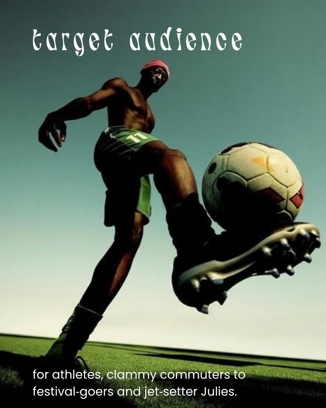
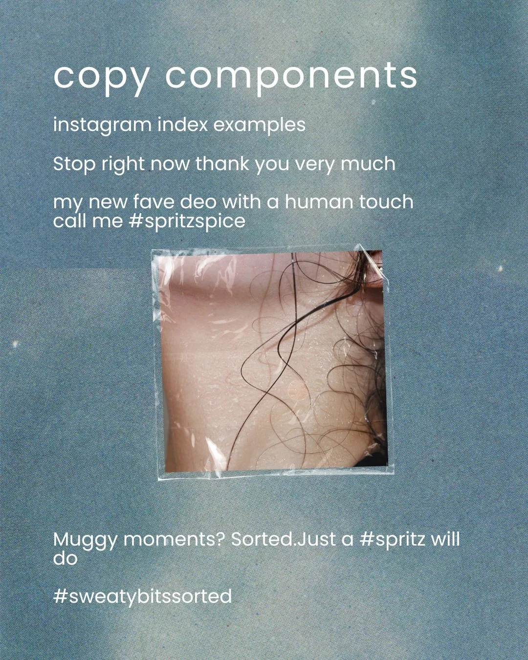
Spritz, designed for
the more intimate
bits
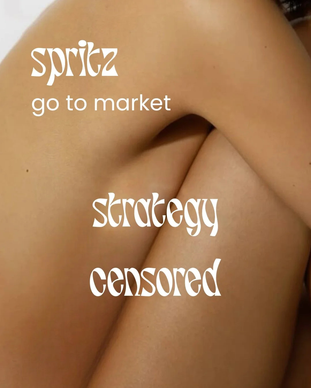
WHY Spritz exists
Spritz was born on a scorching spring day on Brighton Beach, watching the discreet sleeve dabs, skirt wafts, T‑shirt flaps and sweat patches that looked like they were out socialising. Nothing dramatic. Nothing unusual. Just humans trying to stay cool in 28‑degree heat.
As I sipped my Hugo Spritz, a thought surfaced - simple, instinctive and hard to ignore. Sweat is ordinary, universal and human, yet the products designed to help in more intimate areas aren’t talked about enough.
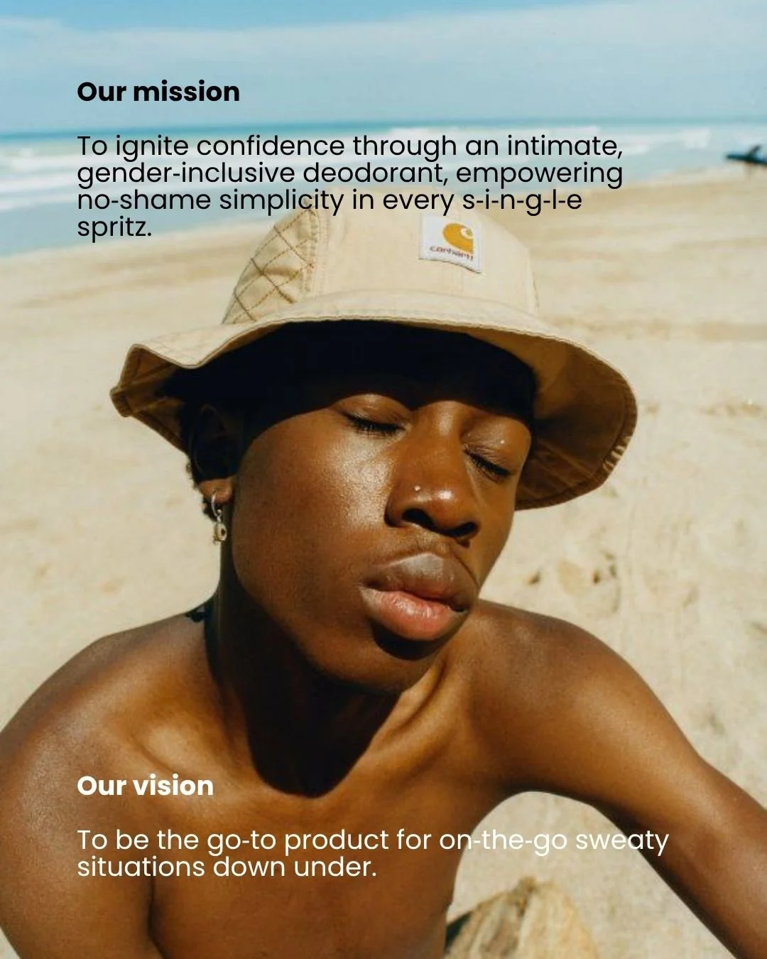
Spritz exists to change that: a modern intimate deodorant that feels convenient, inclusive and faff‑free - not clinical, gendered or shame‑coded.
WHAT I explored
I set out to demonstrate how I approach brand narrative and marketing strategy from ideation to execution. I explored how to build a positioning that feels culturally in sync, clear and considered - shaping a tone of voice that speaks with candour and authenticity.
I mapped the strategic layers of brand building, from identifying the touchpoints that connect with real people to defining the messaging architecture that supports them. I also explored the creative direction to hand over to visual branding teams.
Every decision was made to show how I translate a human moment into a brand and product that reduces sticky situations in intimate areas - in a way that feels inclusive, diverse and ready for market‑awareness positioning.
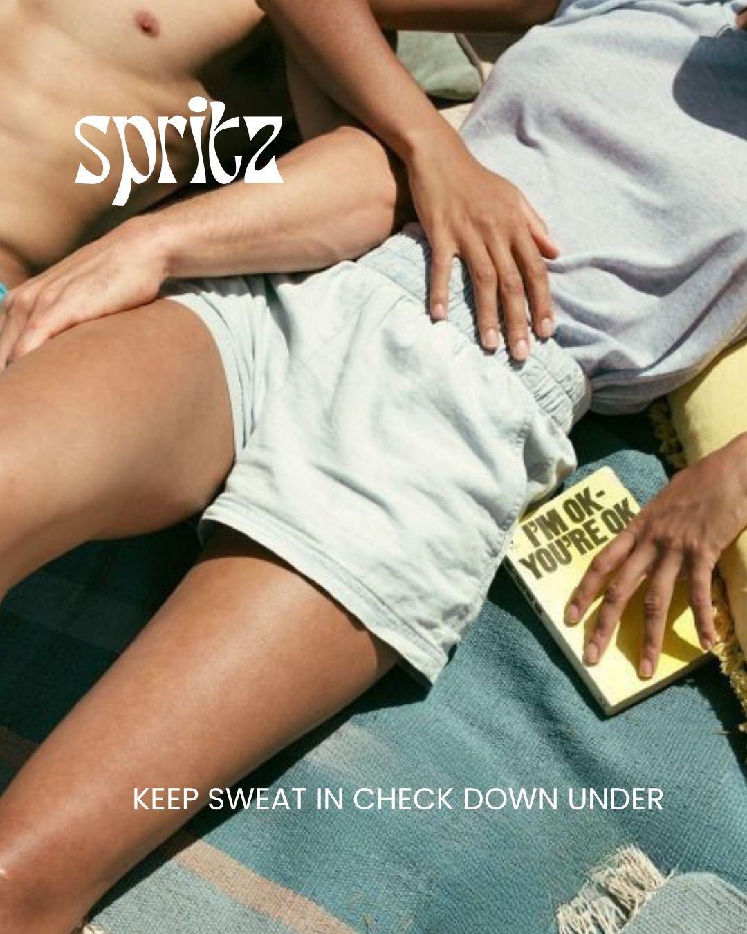
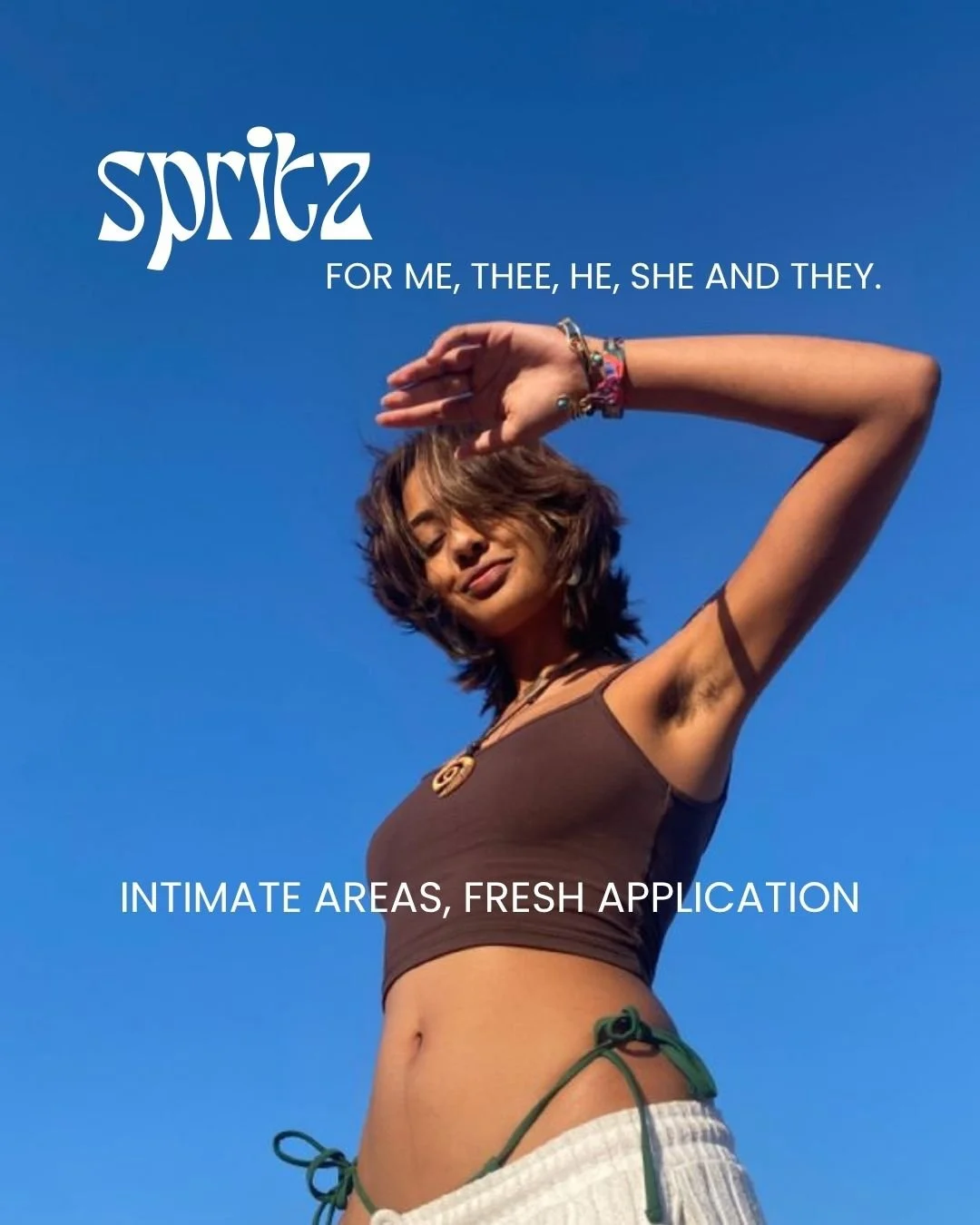
HOW it shows up
Spritz shows up with the same honesty as the moment it came from: warm‑weather realism and a tone that doesn’t tiptoe around the topic. It speaks in clean, confident lines shaped by real behaviour - the sleeve dab, the skirt waft, the shared stickiness of a hot afternoon. It’s inclusive by design, unisex by intention and built to fit into daily routines without fuss.
From its minimalist aesthetic to its sweat‑positive messaging, Spritz shows up as a brand that treats people like… people.
WHAT it says about
me
Spritz reflects how I think and create. I notice the small, human moments most people overlook, and I build from insight rather than assumption. I care about emotional intelligence as much as aesthetics, and I design for real people in real situations - not hypothetical personas.
It shows that I can take a slightly taboo, slightly awkward topic and turn it into something warm, inclusive and commercially grounded. Spritz shows I’m someone who sees clarity in the everyday, and who can turn a moment of noticing into a brand with character, purpose and cultural fluency.
It’s a concept built with strategic thinking, intentional messaging and creative direction that speaks directly to a variety of segmented audiences.
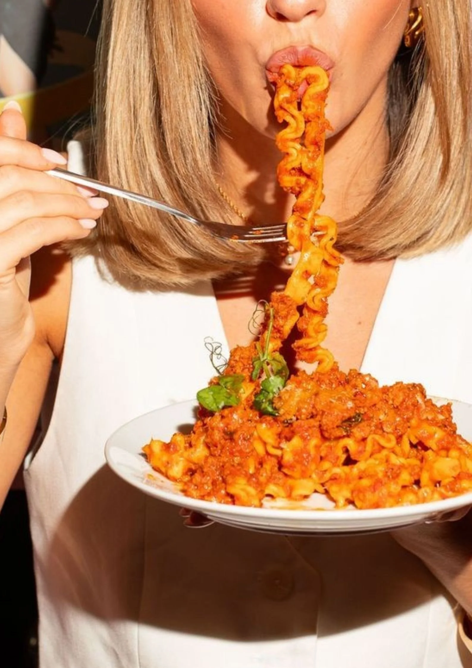
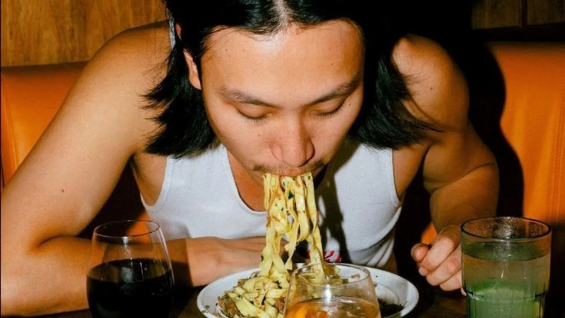
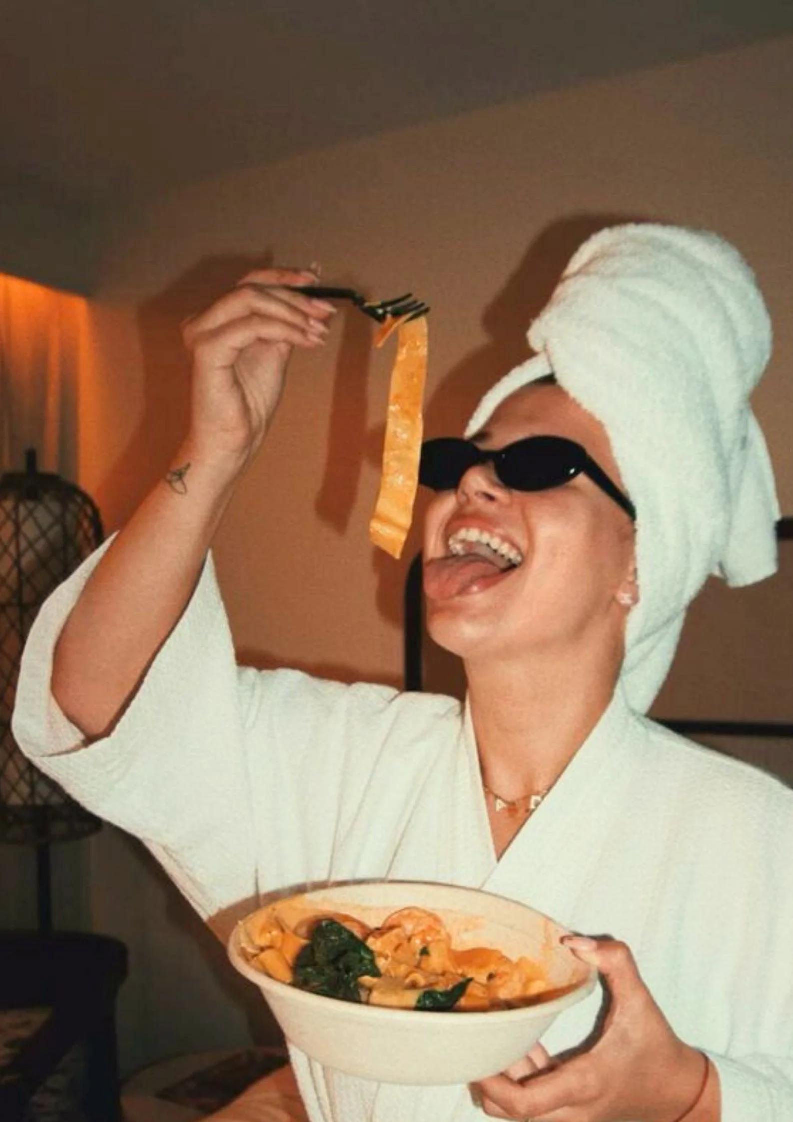
Say ciao to Poppd’
a flavour-forward selection of pasta sauces bringing joy to every bowl.
Most pasta brands sell a product. Poppd’ sells a feeling - a reason to gather around the table, upgrade the contents of your tupperware or head outside for an al fresco moment.
Powered by carbs and fuelled by flavour, Poppd’ brings personality back into pasta sauces, turning everyday meals into modern culinary moments worth sharing.
Inspired by Cosima and Oscar’s travels across Southern and Western Europe, Poppd’ imagines a range of sauces shaped by fusion, spice and the kind of flavours that sing. Each jar is crafted with no nasties, locally sourced ingredients and packed with saucy notes.
The vision is simple: to become a pantry staple with personality - a brand that feels as joyful as the dishes it helps create.
Every stylish jar comes with saucy suggestions to encourage culinary play based on your mood, dietary needs and the flavours you fancy. Poppd’ isn’t just an easy fix - it’s a delicious lunch or dinner decision, inviting you to choose your next flavour‑filled feast.
It reflects how I think about brand storytelling, strategic positioning and consumer‑led creativity, shaping concepts that feel intentional, expressive and ready for market.
What flavour will YOU
add to your feast?
Dinner served
with main
character
energy.
Sauce that sings.
Powered by
carbs, fuelled
by flavour.
Sauce scenario.
Millie went for
Chilli.
More than a
meal, it’s a
mood.
WHY Popp’d exists
Popp’d is my way of reimagining a heritage category that’s often boxed in by tradition. I wanted to explore how pasta sauce - an everyday commodity - can show up in culture‑led spaces with flavour, personality and a social‑first spirit.
It’s a brand built to feel modern, expressive and rooted in the joy of shared meals.
WHAT I explored
I leaned into pasta sauce as a lifestyle, not just a meal. A ritual. A moment. A mood.
I used language, tone and visual direction to shift a category dominated by sameness into something expressive, fragrant and rooted in modern food culture.
Poppd’s world is built on bold, conversational copy and a tone designed to cut through a saturated market. Every line is crafted to feel current, human and intentionally playful - the kind of messaging that sparks engagement, saves, shares and smiles.
This exploration reflects how I think about brand narrative, category differentiation and social‑first creativity when shaping a brand from the ground up.
HOW Popp’d shows
up
From scroll‑stopping statements to emails that won’t be Popp’d straight into deleted items, the brand shows up with flavour, confidence and cultural awareness. The aim was to build a world that feels intriguing, modern and pantry‑staple worthy - a brand that talks to tastebuds as much as it talks to people.
Thanks to Mariyam and our proactive approaches, the visual identity is beginning to take shape, bringing the tone, flavour and personality of Poppd’ into a cohesive brand experience.
WHAT this says about
me
Popp’d is one example of how I take a popular product and use personas to connect with audiences across different platforms in ways that feel clear, confident and considered. Same message, different formats, same intention.
It reflects my ability to craft social‑first worlds that feel human, relatable and rooted in real behaviour - and to build brands with clarity, creativity and commercial awareness. It shows how I turn everyday moments into strategic, expressive concepts ready for market.
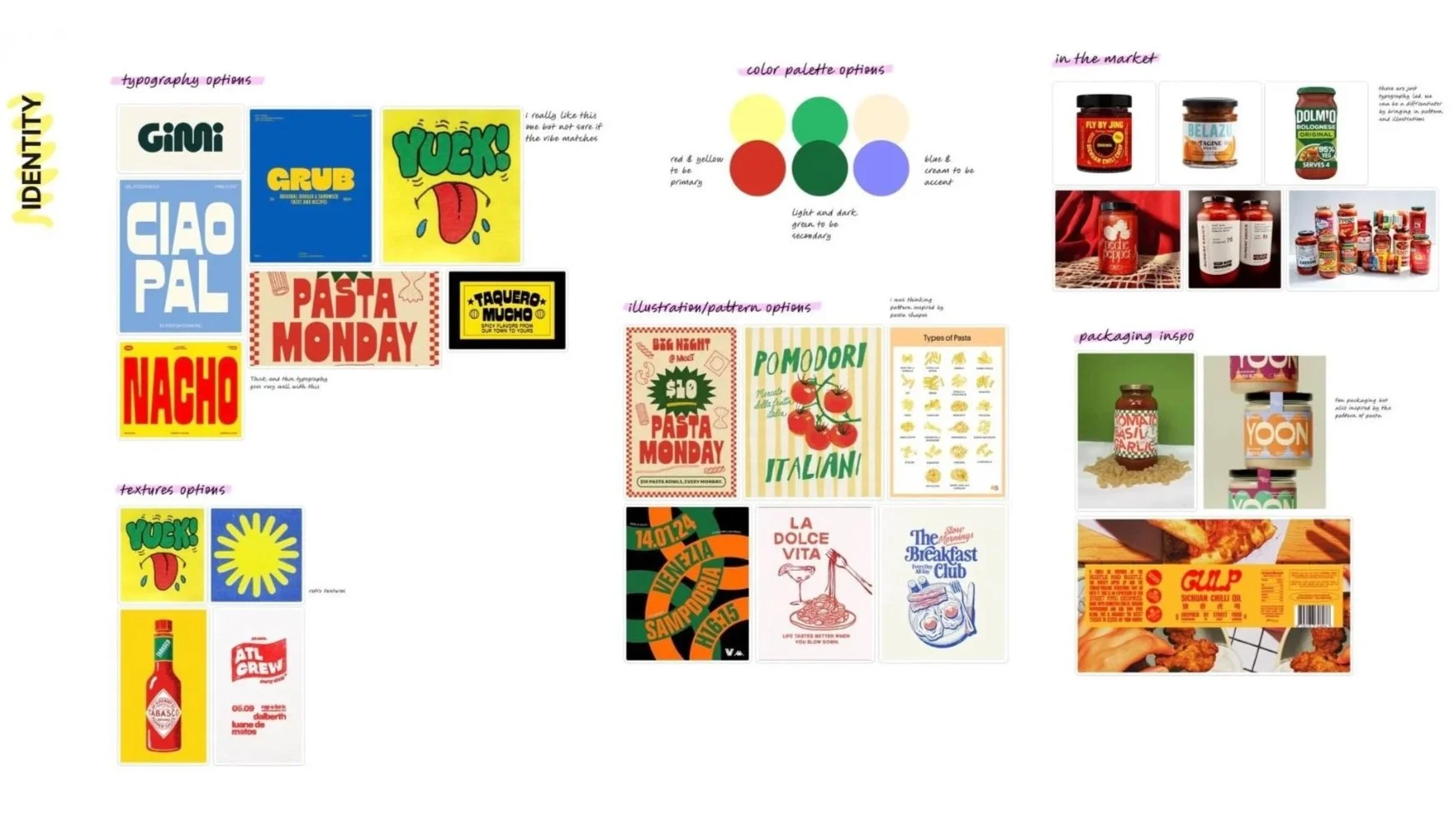
Collab
I spent time defining Poppd’s tone of voice principles, core narratives and campaign directions - but to bring the visual identity to life with real pizzazz, I needed a creative partner.
Through organic outreach on LinkedIn, I connected with Mariyam, a graphic designer whose style, energy and vision aligned perfectly with where I wanted to take Poppd’.
Together, we’ve been exploring typography, colour, illustration and packaging to shape an identity that feels expressive, stand‑out and irresistible to purchase. This collaboration reflects how I work: with passion, ambition and the ability to bring an idea to life alongside a designer - just as I do in other teams and settings.
It demonstrates my approach to cross‑disciplinary collaboration, creative partnership and brand‑world building - working hand‑in‑hand with visual specialists to build something memorable, meaningful and distinctive.
Here’s a sneak
peek of our
creative direction
and visual identity
work in
development